07 Dec The Argument Graph
The Argument Graph – A Graphic Organiser for Argument
A graphic organiser visualises relationships between facts, concepts, or ideas using a diagram. Common examples are: a Venn diagram, a timeline, a flowchart, a mind map, or a story board.
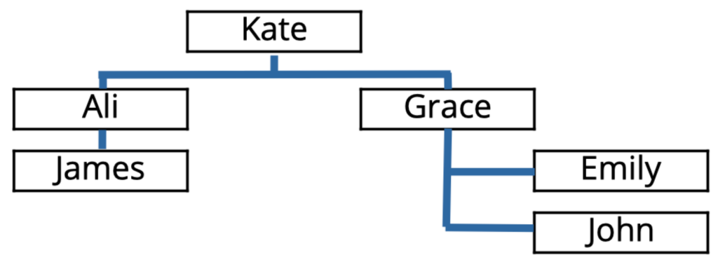
Different types of graphic organiser deal with different kinds of information. Some are used to represent relationships between pairs of objects and these are typically drawn with boxes representing the objects and lines or arrows representing a relationship between them. A typical example is an organisation chart.
An organisation chart is a familiar graphic organiser for work relationship information. The boxes represent people and the lines represent the “supervisor/subordinate” relationship, with supervisor placed above subordinate.

The key to a good graphic organiser is to shift some of the cognitive load of understanding from reading text to looking at the graphical elements. For example, in the organisation chart, once it is understood that a supervisor box is placed above their subordinate’s box and connected to it by a line, then any organisation can be understood instantly. It’s lot quicker than reading the information as text. Flow charts and mind maps are organised in a similar way.
A similar approach can be used for arguments. An argument can be represented as a system of logical relationships between statements. The statements go in the boxes and the arrows show the logical relationships, such as being a premise or a conclusion.
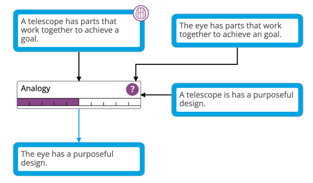
This is one step of Paley’s argument. The blue boxes are statements and the arrows are logical relations: black = premise, blue = conclusion. The arrows point in the direction of the “flow” of the argument – from its premises to its conclusions.
The central box is the argument type. This specifies the kind of inference being used, in this case, analogy. The analogy is that the telescope has similar parts to the eye. Since we know the telescope has a purposeful design, we infer the eye probably does as well.

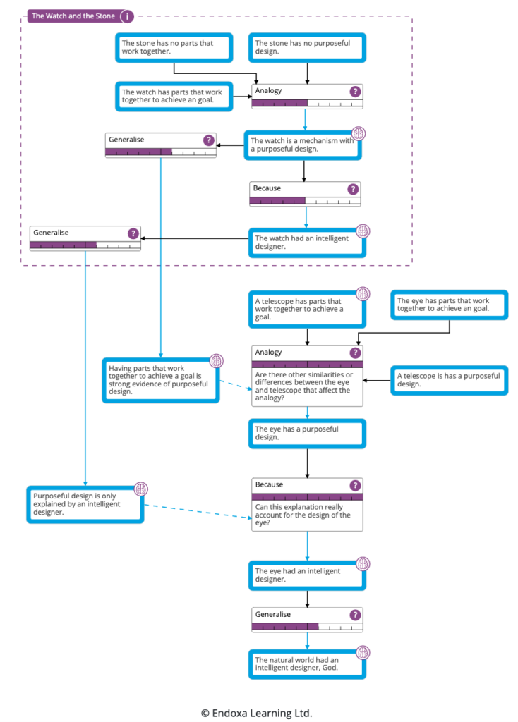
The entire argument can be represented in this way with one step following another. The argument flows from top to bottom of the diagram.
The structure of the argument is always reflected in the structure of the argument graph. In this case, there are two main parts: the disanalogy of the watch and the stone, which provides support for the analogy of the telescope and the eye. The argument graph has less than 5% of the word count of the original text, making it quick and easy to grasp. This is typical for argument graphs.
The criteria for an effective graphic organiser are met by the argument graph:
i. It only shows statements which are part of the argument and the amount of text is reduced enormously; the logical relations between statements are shown by the arrows.
ii. The structure of the argument is immediately clear.
iii. The inference used in each step is specified using the argument types.
Once students have learned the meaning of the boxes and arrows, they will be able to learn more effectively from an argument graph in Endoxa Learning than from the text source. They can also use the graphical platform to create their own arguments.
This isn’t just a theory. There is a lot of academic research into visualisation of argument showing that students’ essay-writing and critical thinking performance improves if they study using argument diagrams rather than only from text-based sources – Click here to see our white paper for a selection of academic references.
In summary, the argument graphs in Endoxa Learning are a powerful graphic organiser for arguments, helping students grasp the material and giving them a visual medium in which to think further about it.
Click the button to read our longer article on how graphic organisers are used in education.


