
28 Nov Visualisation in Education
Using Diagrams in Education
Visualisation of complex information is very common in education and elsewhere. Diagrams of many different kinds are used because they are often simpler for students to understand than presenting information as blocks of text or numbers.
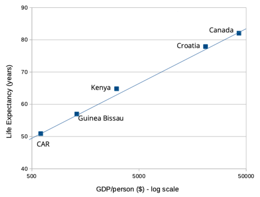
A familiar example is a chart. Charts are used to represent numerical information. There are various kinds, such as bar charts, pie charts, scatter charts, and so on. It is clear that using a chart to represent numerical information can promote learning by making it easier to understand – see fig. 1.
Fig. 1: Charts are superior to text at displaying numerical information
Information as Text
Canada has a GDP/person of $42844 and a life expectancy of 82.30 years.
Central African Republic has a GDP/person of $605 and a life expectancy of 50.88 years.
Croatia has a GDP/person of $20905 and a life expectancy of 77.89 years.
Guinea Bissau has a GDP/person of $1313 and a life expectancy of 56.96 years.
Kenya has a GDP/person of $3090 and a life expectancy of 64.8 years.
Information as a Chart
Charts are so commonplace that it is hard to remember that they were once an invention. There are no pie charts carved on the walls of Egyptian pyramids; no one was plotting data on x-y axes before Descartes. The axes, the data points and every other part of a scatter chart are a graphical convention that was once invented and then taught to students. (And took a while before it became accepted.) This is true for all forms of data visualisation.
Nowadays diagrams representing information are widely used within education. There is a lot of theory and practice supporting their use, in particular dual coding theory. See our longer article for further explanation and a selection of academic references.